Are your designs failing to connect with users? The secret might be in your layouts in design. A great layout is the foundation of effective visual communication, guiding users, clarifying your message, and creating a seamless experience. This guide unlocks the core principles, grid systems, and responsive techniques you need to transform your designs from confusing to compelling, ensuring your message resonates on any device.
Why a Strong Layout is the Backbone of Great Design
Before diving into the “how,” it’s crucial to understand the “why.” A well-executed layout is more than just arranging elements on a page; it’s a strategic process that dictates how your audience interacts with your content. It’s the invisible force that brings order to chaos and turns a simple page into a powerful communication tool.
What is Layout Design and Why Does It Matter?
Layout design is the art of arranging visual elements—such as text, images, and shapes—on a page. This applies to a website, a magazine, or any other design medium. The primary goal is to present information in a clear, engaging, and logical manner. The importance of layout in graphic design cannot be overstated; it directly influences readability, usability, and the overall user experience.
At LIEN MMO, we’ve seen firsthand how a strategic approach to layouts in design can dramatically improve performance. It’s the difference between a user who stays and engages, and one who gets frustrated and leaves. A thoughtful layout establishes a strong visual hierarchy, making it effortless for users to find what they need.
The Real-World Impact: How Layout Influences User Experience and Conversion
A confusing layout creates a poor user experience. When users can’t find information easily, they become frustrated and are more likely to abandon your website or app. This directly impacts your conversion rates. Conversely, an intuitive layout guides the user’s eye, making the journey from discovery to action feel natural and effortless.
Effective content organization through smart layout choices reduces cognitive load. This means users don’t have to think hard to navigate your design. This seamless experience builds trust and credibility, encouraging users to take desired actions, whether it’s making a purchase, filling out a form, or consuming more content.
Key Elements of Layout: Beyond Just Text and Images
While text and images are the primary content, a successful layout considers several other crucial design elements. These components work together to form a cohesive and effective composition.
- White Space (or Negative Space): This is the empty space around elements. It’s not wasted space; it’s an active element that reduces clutter, improves focus, and creates a sense of sophistication.
- Typography: The choice of fonts, their size, and spacing significantly impacts readability and tone.
- Lines and Shapes: These can be used to divide sections, direct the eye, and create a sense of movement or structure.
- Color: Color palettes evoke emotion, create contrast, and help organize information.
The Core Principles: Mastering the Rules of Visual Communication
To create effective layouts in design, you must understand the fundamental principles of layout design. These rules govern how viewers perceive and process visual information. Mastering them allows you to control the narrative and guide the user experience with intention.
Creating Order and Focus with Visual Hierarchy
Visual hierarchy is arguably the most critical principle. It involves arranging elements to show their order of importance. The most important information should be the most prominent. You can achieve this through variations in size, color, contrast, and placement. A clear hierarchy ensures users notice the headline first, then the subheadings, and finally the body text.
Achieving Stability with Balance: Symmetrical vs. Asymmetrical
Balance provides stability and structure to a design. It distributes the visual weight of objects, colors, texture, and space.
- Symmetrical Balance: Elements are mirrored on either side of a central axis. This creates a sense of formality, order, and tranquility. It’s often used in more traditional designs.
- Asymmetrical Balance: The two sides are not identical, but the elements are arranged to have equal visual weight. This creates a more dynamic, modern, and engaging composition.
Using Proximity and White Space to Group and Separate Information
Proximity involves placing related items close together. This simple act creates a visual unit, signaling to the user that these elements belong to the same group. This helps in content organization and reduces clutter. White space works in tandem with proximity, creating the necessary separation between different groups of information, which is essential for readability.
Driving Attention and Readability with Contrast and Alignment
Contrast helps elements stand out. High contrast, like bold text or a bright call-to-action button, draws the user’s attention. It’s vital for creating focal points and improving readability. Alignment is the principle of placing items so they line up. A consistent alignment creates a clean, organized, and sharp appearance, connecting elements visually even if they are far apart. Adhering to these core design principles is what separates amateur work from professional design.
Grid Systems: Your Blueprint for Clean and Organized Designs
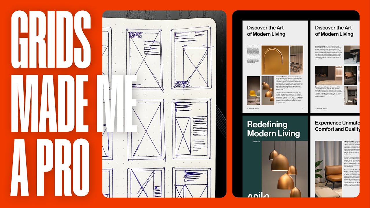
If principles are the rules, then grid systems are the framework that helps you apply them consistently. A grid provides a structure of intersecting lines—vertical and horizontal—that guide the placement of elements, ensuring alignment and consistency across your design.
What are Grid Systems and How Do They Work?
A grid system is a foundational tool used to bring order and consistency to a layout. It breaks down a page into columns and rows, providing a clear structure for you to place your content. This structured approach helps maintain alignment and proportion, resulting in a cleaner and more professional-looking design. Learning how to use grids in design is a game-changer for any beginner.
Types of Grids: Column, Modular, and Baseline Grids Explained
Different projects require different types of grids. The most common include:
- Column Grid: This is the most common type used in web design. It divides the page into a set of vertical columns, which is perfect for organizing content across a website.
- Modular Grid: This grid extends the column grid by adding horizontal rows, creating a matrix of cells or “modules.” It’s ideal for complex projects like magazines or e-commerce sites that require more intricate organization.
- Baseline Grid: This is a dense grid of horizontal lines that ensures all text shares a common baseline. It creates a strong vertical rhythm and is crucial for achieving typographic harmony.
Practical Application: How to Use Grids in Figma and CSS (Flexbox & Grid)
Modern design and development tools have made implementing grid systems easier than ever.
In design software like Figma, you can easily set up layout grids directly on your frames. This allows you to define columns, margins, and gutters, ensuring your design template is perfectly aligned from the start.
For web development, CSS provides two powerful tools for creating grid-based layouts:
- Flexbox: A one-dimensional layout model perfect for aligning items in a row or a column. It’s excellent for components like navigation bars and form elements.
- CSS Grid: A two-dimensional layout system that allows you to control both columns and rows. CSS Grid is the ideal solution for creating complex, full-page web layouts.
Designing for Every Screen: Mastering Responsive Web Layouts
In today’s multi-device world, your layouts in design must be flexible. Responsive web design ensures that your layout adapts seamlessly to different screen sizes, from mobile phones to desktop monitors, providing an optimal viewing experience for everyone.
The Shift to Mobile-First: What It Means for Your Layout
The mobile-first design approach means you start designing for the smallest screen first and then work your way up to larger screens. This strategy forces you to prioritize content and focus on the core user experience. It often leads to cleaner, more efficient designs because you eliminate non-essential elements from the very beginning.
Fluid vs. Adaptive Design: Choosing the Right Approach
When creating responsive designs, you’ll encounter two main approaches:
- Fluid Layouts: These use relative units, like percentages, to make the layout stretch or shrink with the screen size. This creates a flexible design that smoothly adjusts to any viewport width.
- Adaptive Design: This approach uses fixed layout sizes. The design detects the screen size and then serves the appropriate layout from a set of predefined options. It’s less flexible but can offer more control over the appearance at specific sizes.
Understanding Responsive Design Breakpoints for Flawless Viewing
Breakpoints are the points at which a website’s layout changes to adapt to a different screen width. For example, you might have a single-column layout for phones, a two-column layout for tablets, and a three-column layout for desktops. Understanding and defining these responsive design breakpoints using CSS media queries is fundamental to creating a truly responsive experience.
Best Practices for Flexible Grids in Modern Web Design
To create robust responsive web design layouts, embrace flexible grids. Use relative units like percentages for column widths instead of fixed pixels. Combine this with media queries to adjust the number of columns, font sizes, and margins at different breakpoints. This ensures your content is always presented in the most readable and accessible way, no matter the device.
By applying the principles of hierarchy and balance, leveraging the structure of grids, and embracing a responsive, mobile-first mindset, you can create intuitive, engaging, and effective designs. A masterful layout is what separates a good design from a great one. Start implementing these strategies today to build better user experiences and achieve your communication goals.
Ready to elevate your design skills? Explore our comprehensive UI/UX design courses and start creating layouts that captivate and convert!

